Smaller Print Projects
These next few projects are a few of my favs that didn’t quite fit into any other category but are still worth celebrating. Have fun looking though the next few pieces. I hope they bring you as much joy as they bring me.
The Problem:
In this project, I was creating some invitations for a important dinner for company investors based on an existing brand. The challenge with this smaller project was to create a invitation that fit within the original branding while also extending the brand to provide new and fresh look that would be recognizable as a connection to the original campaign while also keeping the audience’s interest. While also working to find a balance so the invites felt elevated and elegant but also warm and inviting.
The Solution:
I created an series of invitations that evoked connection to the original branding while also extending the brand with the addition of new assets like the topographic map texture and a fresh new font. The series of designs lived as both a digital and print invites and successful aided in the investment dinner turnout .
The Problem:
In this project, I was tasked to create artwork that would notify guest that the building’s cafe was under construction. The prompt was to be informative while also playful with the design to hopefully spark interest as individuals walking by. I also hoped to help extend the cafe’s branding to lengthen it’s life before the need for a brand refresh
The Solution:
I was able to create a few poster options for the retail team to decide in two different sizes. One a smaller 8.5 x11 and another a larger 24 x36 poster size. They decided to go with a textured badge design that felt very true to the cafe’s branding, but I am proud of all the iterations I was able to create.
The Problem:
In this project, I was asked to create artwork for a holiday event specific to a certain campus. That included print invitations, social graphics and larger side screen that would be presented on the weekend during a service. The team wanted the design to feel fresh and Christmas forward while also highlighting the pizza and caroling that was part of the event.
The Solution:
This was a really fun project to design. I had a lot of creative freedom to play with different design ideas of how to capture the feeling of the holiday event. I shared with the team lots of iterations and they chose the option was full of beautiful winter foliage.
Below are the iterations I shared with the team.
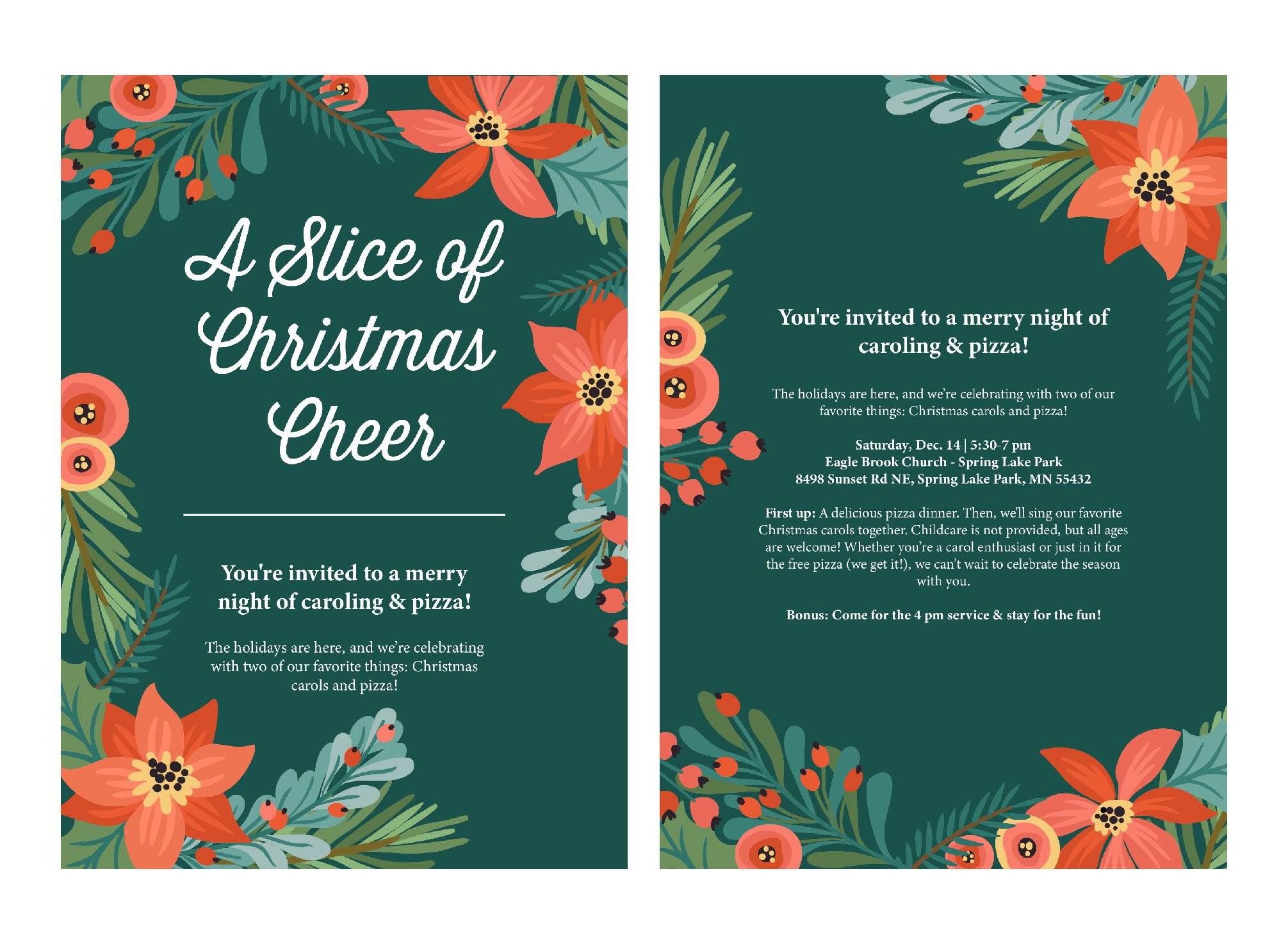
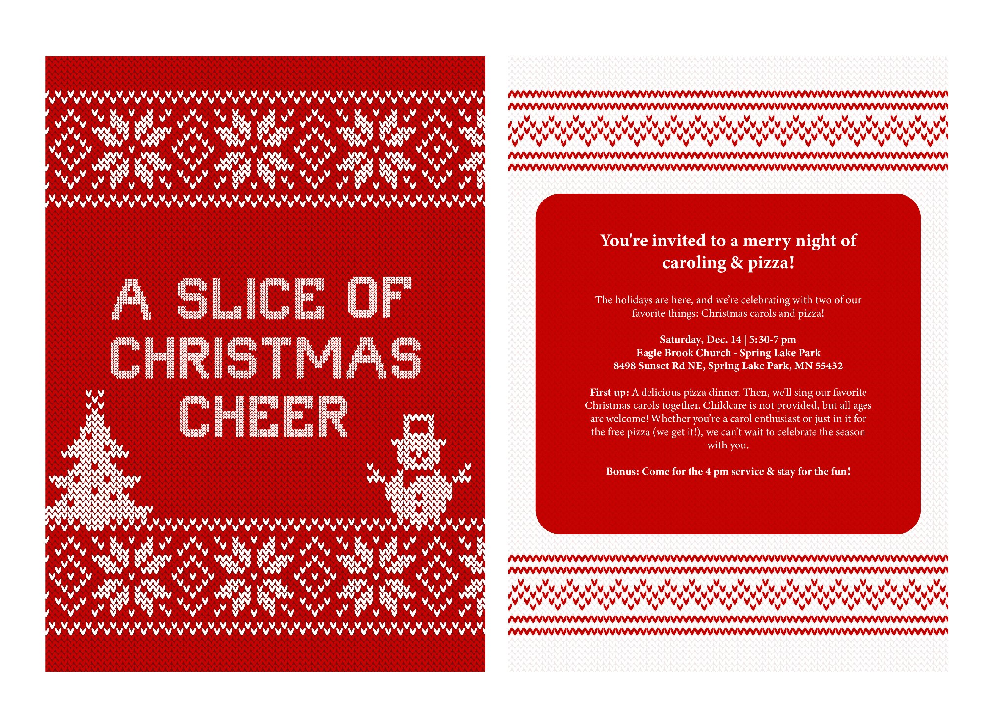
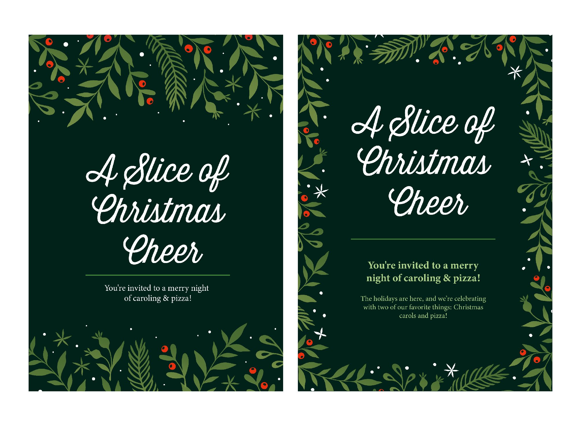
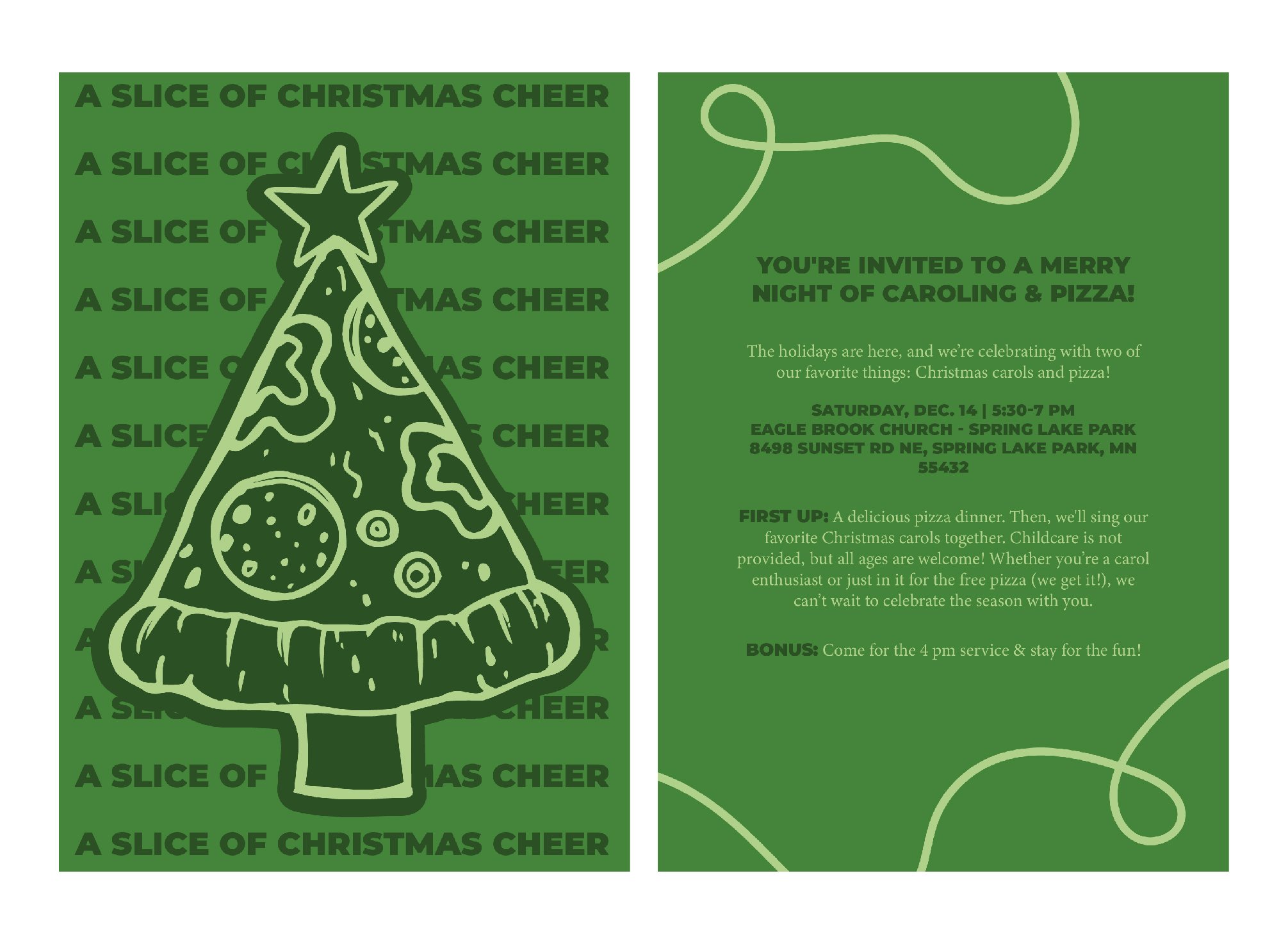
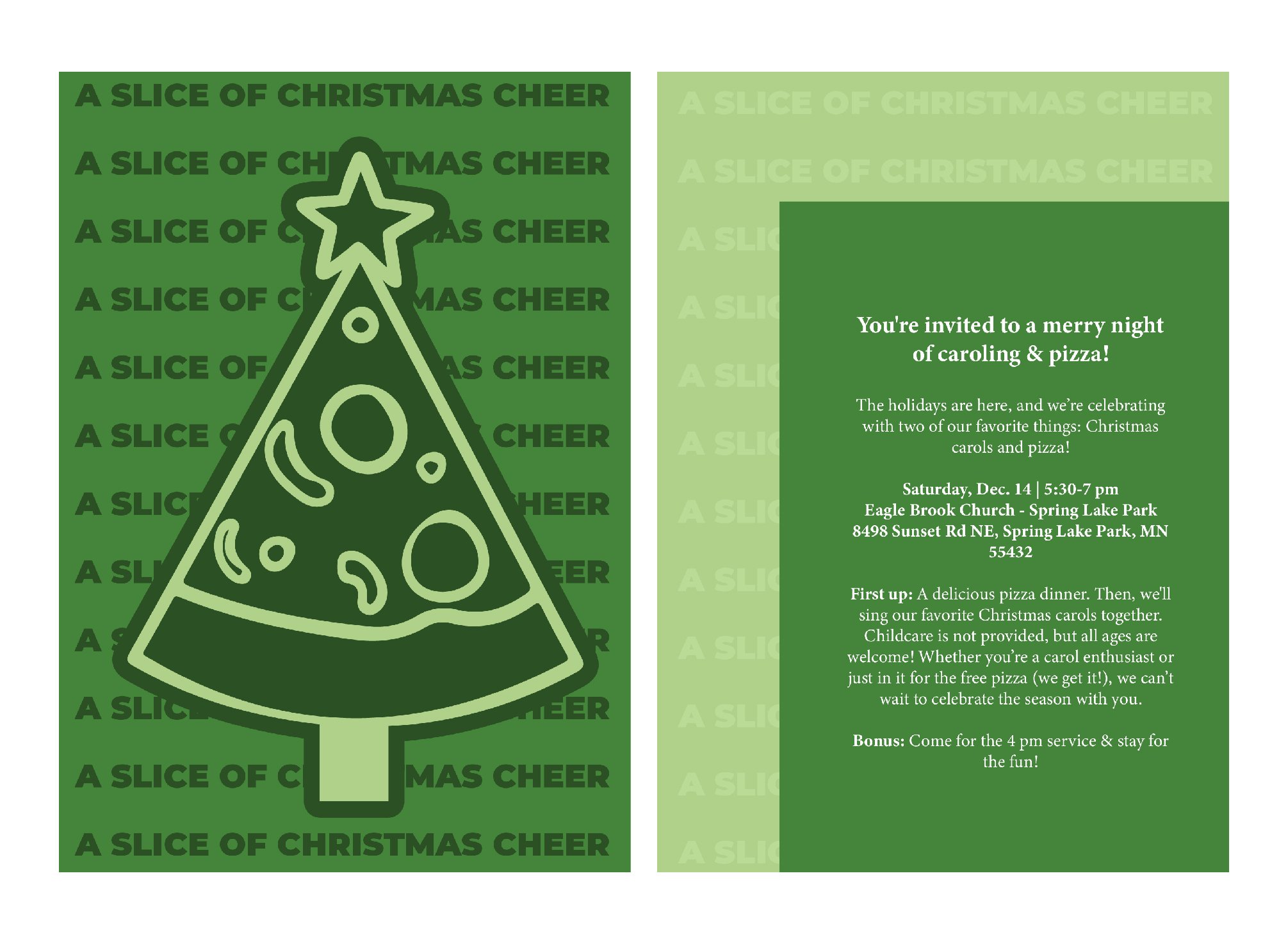
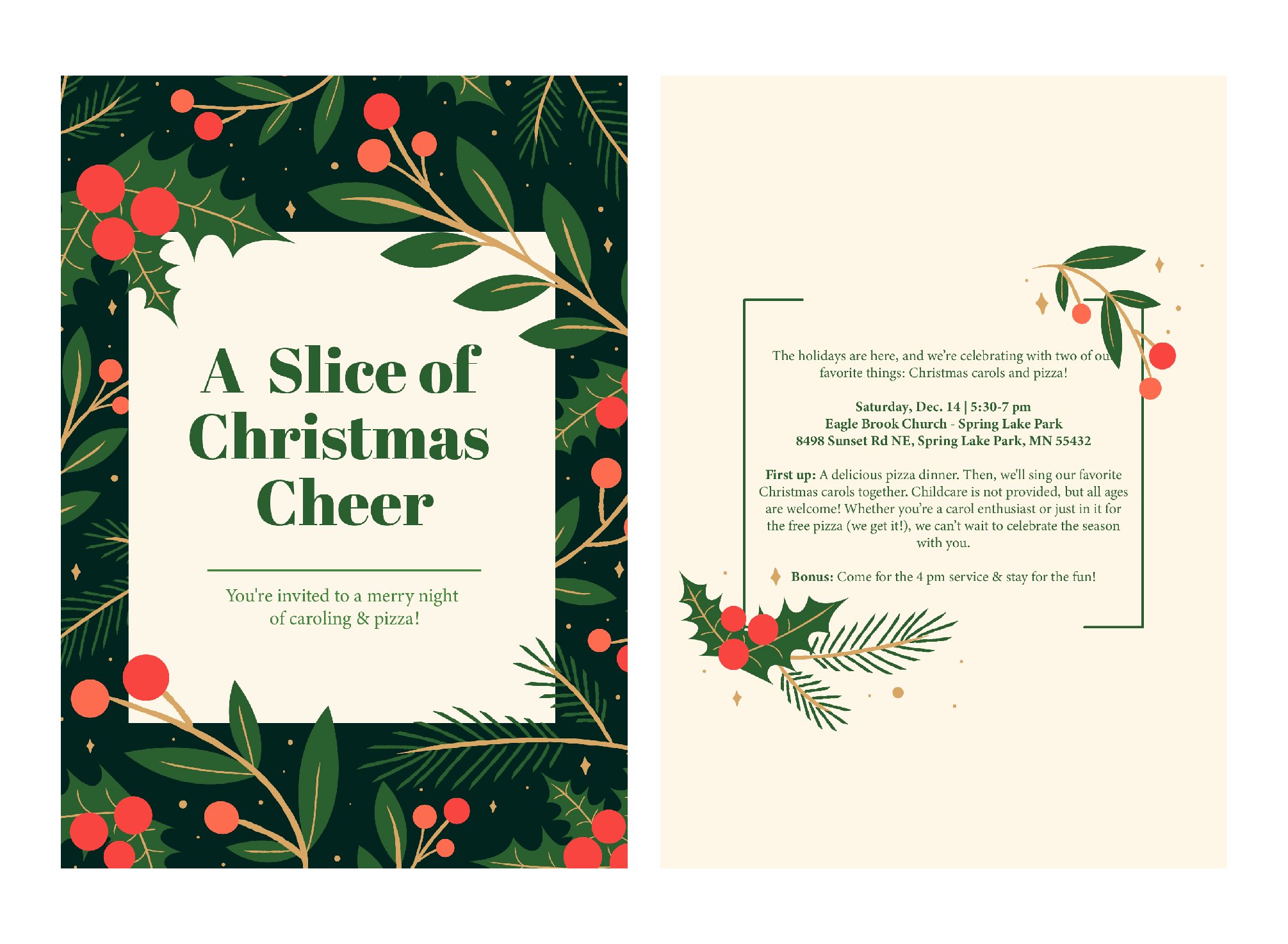
Below is the final Chosen design with the iterations for the print invitation and the side screens, and social graphics.
All designs are property of Eagle Brook church


